Trends
Sage Green Interior Design: Why It's Everywhere in 2026
By Greylyn Wayne · June 2, 2026 · 7 min read
Sage green is the color of the year for a reason. Here's where to use it, what to pair it with, and the swatch-level mistakes to avoid.
If you've felt like sage is suddenly on every cabinet, wall and sofa lately, you're not imagining it — sage green interior design trends are leading the 2026 palette, and in the Pacific Northwest they feel especially at home. Sage is the soft, gray-leaning green of dried herbs and eucalyptus: muted enough to act as a neutral, alive enough to add warmth. It's the rare color that calms a room and quietly makes it feel more expensive at the same time.
Below is a practical, swatch-level guide to working with sage — why it works, exactly where to put it, what to pair it with, and the handful of mistakes that turn a beautiful green muddy. For more on how sage fits into the broader palette this year, see our roundup of interior design trends 2026.
Why Sage Green Works So Well
Sage earns its keep for a few specific reasons. First, it's restful — green sits at the calm middle of the spectrum, and the gray in sage takes the edge off, so it soothes rather than energizes. That makes it ideal for the rooms where you actually want to slow down: kitchens, bedrooms, bathrooms, reading nooks.
Second, it's a chameleon neutral. Because it carries gray, sage plays the role of a soft neutral — it pairs with nearly everything and never fights for attention. And third, it belongs here. Portland's light is flat and cool for much of the year, and the view out most windows is green; sage echoes the firs, ferns and moss outside, so a sage room feels connected to the landscape instead of imposed on it. It's biophilic design without a single houseplant.
Where to Use Sage Green
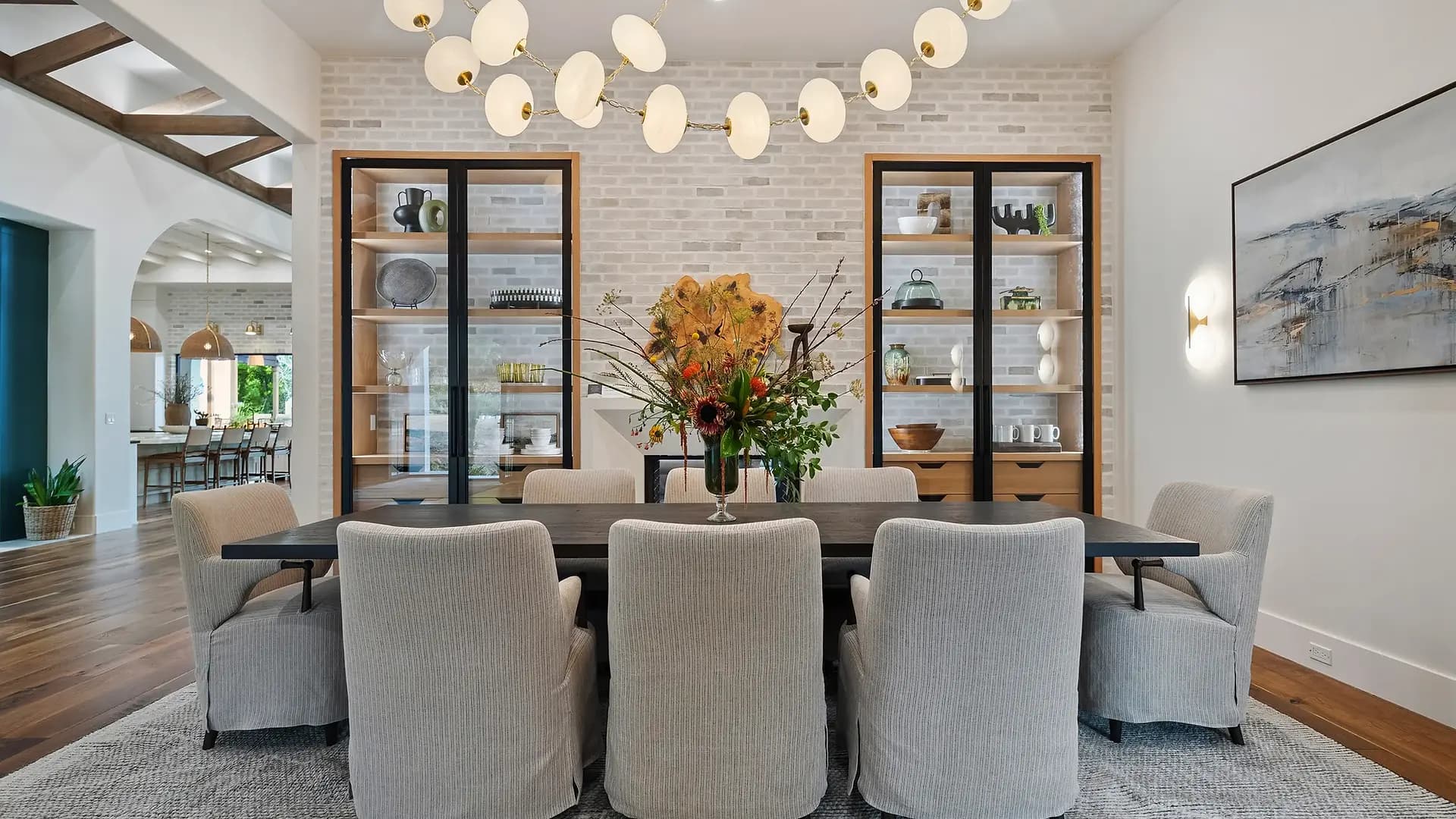
Kitchen Cabinets
Sage cabinetry is the single most popular way to bring the color in, and for good reason: it's softer than navy, warmer than gray, and far more forgiving than a trend-driven bold. On lower cabinets with a white or pale upper, it grounds the room; on a full set, it envelops it. Pair it with unlacquered brass or warm-bronze hardware, a creamy quartz or honed marble counter, and natural-wood open shelving.
Walls
Because sage behaves like a neutral, you can take it across a whole room — including the trim and ceiling for a gentle color-drenched effect — without it feeling overwhelming. A lighter sage opens up a small space; a deeper, grayer sage cocoons a study or a north-facing bedroom. Always test a large swatch on more than one wall and check it at morning and evening, because sage shifts noticeably with the light.
Tile and Backsplashes
Sage zellige or handmade ceramic tile gives a backsplash or bathroom subtle depth — the slight color variation between tiles catches light beautifully and reads as crafted, not flat. It's a lower-commitment way to test the color in a contained space before you take it to the cabinets.
Upholstery and Bedrooms
A sage linen or velvet sofa, a slipper chair, or a tailored headboard introduces the color at furniture scale. In bedrooms especially, sage delivers — it's quieting at exactly the moment you want a room to wind down. Layer it with cream and oatmeal bedding and warm wood, and the room reads serene rather than cold.
What to Pair With Sage Green
Sage is generous, but it looks its best in specific company. These are the pairings we return to again and again.
- Warm woods — white oak, walnut and natural ash keep sage from feeling cold and tie it to the organic-modern look defining 2026.
- Brass and bronze — warm metals are the perfect counterpoint; unlacquered brass that ages over time is especially lovely against sage.
- Cream and oatmeal — soft off-whites give the eye a place to rest and let the green read crisp instead of murky. Skip stark, blue-white whites.
- Terracotta and clay — a touch of warm rust or terracotta is sage's complementary partner; even a single clay planter or rust pillow makes the green sing.
- Black accents — used sparingly (a matte-black faucet, a slim picture frame, an iron pull), black sharpens sage and keeps the palette from going too soft or sweet.
A reliable formula: sage as the lead, warm wood and cream as the supporting players, brass as the jewelry, and a small dose of terracotta or black as the accent. Get those proportions right and the room feels effortless.
Mistakes to Avoid With Sage Green
Sage is forgiving, but a few missteps can undercut it. Watch for these.
- Pairing it with cool, blue-white whites or chrome — the contrast goes cold and clinical, and the green can read gray and lifeless. Choose warm whites and warm metals instead.
- Skipping the swatch test — sage is highly sensitive to light. A green that looks perfect in the store can turn gray, yellow or even minty on your wall. Always test a big sample in your own room, at your own hours.
- Choosing too yellow or too gray a sage — too much yellow drifts toward avocado; too much gray drifts toward sad and flat. Aim for a balanced, herbal sage and confirm the undertone on a swatch.
- Going monochrome — an all-sage room with no warm wood, no cream and no metal contrast falls flat. Sage needs warm companions to come alive.
- Overdoing the accents — sage works because it's calm. Crowding it with too many competing colors erases the very serenity that makes it worth using.
Make Sage Work in Your Space
Sage green is one of those rare colors that's both very of-the-moment and genuinely timeless — handled with warm woods, cream and brass, it will still feel right long after the trend cycle moves on. The key is getting the undertone and the pairings dialed in for your particular light, which is exactly the kind of thing worth a second opinion. Whether you're choosing a cabinet color or rethinking a whole room, our interior design team is happy to help you land on a sage that loves your home — start with a free design consultation and we'll talk swatches.
Frequently Asked Questions
Is sage green still in style in 2026?
Yes — sage green is one of the leading colors of 2026 and a cornerstone of the year's warm, nature-led palette. Because it behaves like a soft neutral, it tends to outlast trend-driven bold colors, so it's a safe choice even as cycles shift.
What colors go with sage green?
Sage pairs beautifully with warm woods (white oak, walnut), brass and bronze, cream and oatmeal, and small doses of terracotta or matte black. Avoid cool blue-white whites and chrome, which can make sage read cold and gray.
Where is the best place to use sage green in a home?
Kitchen cabinetry is the most popular and forgiving spot, but sage also shines on walls, in zellige or ceramic tile, on upholstery, and in bedrooms — anywhere you want a calm, restful feel. Lighter sages open small rooms; deeper sages cocoon studies and north-facing spaces.
Why does my sage green paint look gray (or yellow) on the wall?
Sage is very sensitive to light and undertone. A green that looks balanced on a chip can drift gray in cool north light or turn yellow in warm light. Always test a large swatch on multiple walls and view it morning and evening before committing.
Does sage green work well in Portland homes specifically?
Especially well. Portland's flat, cool light and green surroundings make sage feel connected to the landscape — it echoes the firs and ferns outside. It also flatters the natural wood found in the area's Craftsman and midcentury homes.
Thinking About Staging or a Redesign?
Greylyn Wayne has staged 2,500+ Portland-area homes and earned 4.9★ across 163 reviews. Tell us about your project — the consultation is free.